Or ready to use framework.
Content
Content of this styleguide is divided into two main categories: design and components. These categories then contain modules. In design category you can find module with preview of color palette and basic styling of typography. In components category you can find modules with documentation for such elements as buttons, form components, icons or documentation for grid system used in this styleguide.
Note
Navigation betwen these categories and modules can be found at left site of page (hamburger menu for small screens).
Modules
Modules are separate sub pages that contain documentation for groups of similar elements. Such as buttons module contain documentation for all variations and extends of buttons. Each module can contain sections and each section can contain subsection. List of sections can be found under main info (or in right sidebar for large screens).
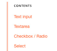
Preview of sections list.
Documentation
In addition to text in documentation, there are few components as example, note, warning or dependency for better explanation and illustration of styleguide elements.
Note
Note is component used for additional informations or documentation.
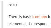
Preview of note.
Warning
Warning is component used for showing importent informations or documentation.
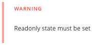
Preview of warning.
Dependency
Dependency component is used in case that explained element require additional files or tools.
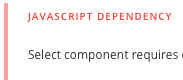
Preview of dependency.
Example container
Example container serves to illustrate visual form or functionality of documented element, including sample code. To show/hide sample code just click on code icon at top right corner.
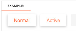
Preview of example container.
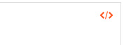
Preview of toggle code.
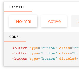
Preview of example with code.
Ready to use framework
After installation of light, this demo is also posible to use as framework, with all components documented in styleguide.